
CSS3渐变进度条效果
大致思路:
1、设计出一个进度条,然后再此进度条的基础上添加伪类,并为伪类添加绝对定位与动画效果
2、为动画添加关键帧,当到达某个节点就发生颜色与宽度的变化
<section class="con">
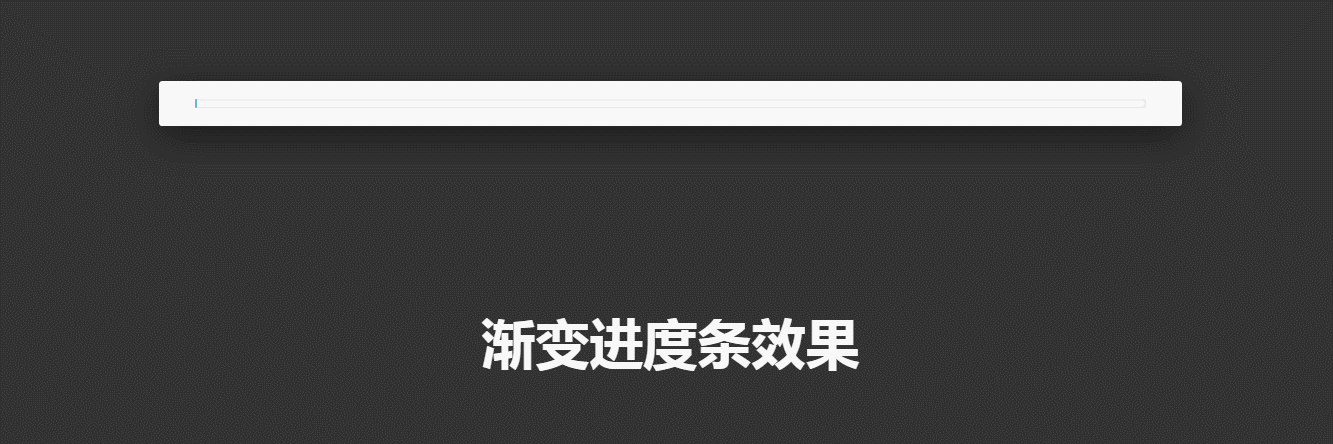
<div class="bar"></div>
</section>
<h1>渐变进度条效果</h1>
css
* {
  margin: 0;
  padding: 0;
}

html,
body {
  width: 100%;
  height: 100%;
}

body {
  background-color: #333;
  /* animation: body 5s linear infinite; */
}

.con {
  width: 50%;
  padding: 20px 40px;
  margin: 200px auto;
  background-color: #fff;
  border-radius: 4px;
  /* 外阴影 */
  box-shadow: 0 10px 40px rgba(0, 0, 0, 0.5);
}

.bar {
  width: 100%;
  height: 10px;
  background-color: #fff;
  /* 内阴影 */
  box-shadow: inset 0 0 5px rgba(0, 0, 0, 0.2);
  border-radius: 3px;
  position: relative;
}

/* 绘制一个用于参与动画的图形 */
.bar::after {
  content: '';
  width: 100%;
  height: 100%;
  border-radius: 3px;
  box-shadow: inset 0 0 5px rgba(0, 0, 0, 0.2);
  /* 子绝父相 */
  position: absolute;
  top: 0;
  left: 0;
  /* css3动画 */
  animation: loading 5s linear infinite;
}

@keyframes loading {
  0% {
    width: 0;
    background-color: skyblue;
  }

  10% {
    width: 10%;
    background-color: rgba(208, 235, 135, 0.445);
  }

  20% {
    width: 20%;
    background-color: rgba(135, 158, 235, 0.664);
  }

  30% {
    width: 30%;
    background-color: rgba(135, 235, 202, 0.74);
  }

  40% {
    width: 40%;
    background-color: rgba(235, 233, 135, 0.445);
  }

  50% {
    width: 50%;
    background-color: rgba(233, 170, 119, 0.445);
  }

  60% {
    width: 60%;
    background-color: rgba(235, 108, 69, 0.644);
  }

  70% {
    width: 70%;
    background-color: rgba(178, 135, 235, 0.445);
  }

  80% {
    width: 80%;
    background-color: rgba(235, 135, 222, 0.445);
  }

  90% {
    width: 90%;
    background-color: rgba(24, 95, 228, 0.548);
  }

  100% {
    width: 100%;
    background-color: rgba(235, 192, 135, 0.445);
  }
}

@keyframes body {
  0% {
    background-color: #ff6369;
  }

  70% {
    background-color: #ffe699;
  }

  100% {
    background-color: #d6e663;
  }
}

h1 {
  color: #fff;
  text-align: center;
  font-size: 60px;
}
代码演示:
评论
匿名评论
隐私政策
你无需删除空行,直接评论以获取最佳展示效果