
CSS3弹跳小球运动效果
大致思路:
1、先将body变成弹性大容器( display: flex;)
2、在一个大盒子box里设置ball与shadow
3、为球和阴影添加动效与关键帧
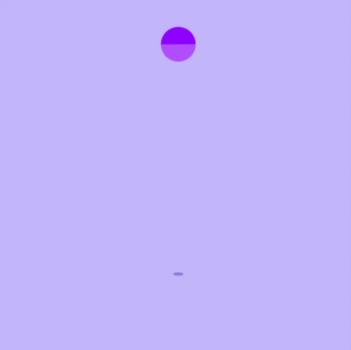
4、球的关键帧有让球垂直方向上发生位置的上移的同时,是球翻滚(旋转),transform: translateY(0) rotate(0deg)
阴影的关键帧让影子垂直方向发生变形,由此适应球上下运动
<div class="box">
  <div class="ball"></div>
  <div class="shadow"></div>
</div>
css
* {
  margin: 0;
  padding: 0;
}

body,
html {
  width: 100%;
  height: 100%;
}

body {
  background-color: #c2b5fa;
  /* 让body标签变成弹性大容器 */
  display: flex;
  /* 让弹性容器中的弹性元素水平居中,垂直居中 */
  justify-content: center;
  align-items: center;
  /* 溢出隐藏 */
  overflow: hidden;
}

.box {
  position: relative;
  top: 100px;
}

.ball {
  width: 50px;
  border-top: 25px solid #b04eff;
  border-bottom: 25px solid #8e00ff;
  border-radius: 50%;
  animation: ani 1.2s linear infinite;
}

/* 设置影子 */
.shadow {
  width: 30px;
  height: 10px;
  background-color: #6643b0;
  border-radius: 50%;
  /* 子绝父相 */
  position: absolute;
  top: 50px;
  left: 10px;
  animation: ans 1.2s linear infinite;
}

/* 让球垂直方向上发生位置的上移的同时,是球翻滚(旋转) */
@keyframes ani {
  0% {
    transform: translateY(0) rotate(0deg);
  }

  50% {
    transform: translateY(-300px) rotate(180deg);
  }

  100% {
    transform: translateY(0) rotate(360deg);
  }
}

/* 让影子垂直方向发生变形 */
@keyframes ans {
  0% {
    transform: scale(1);
    opacity: 1;
  }

  50% {
    transform: scale(0.5);
    opacity: 0.5;
  }

  100% {
    opacity: 1;
    transform: scale(1);
  }
}
代码演示:
评论
匿名评论
隐私政策
你无需删除空行,直接评论以获取最佳展示效果