
CSS3制作旋转饼状图
大致思路:
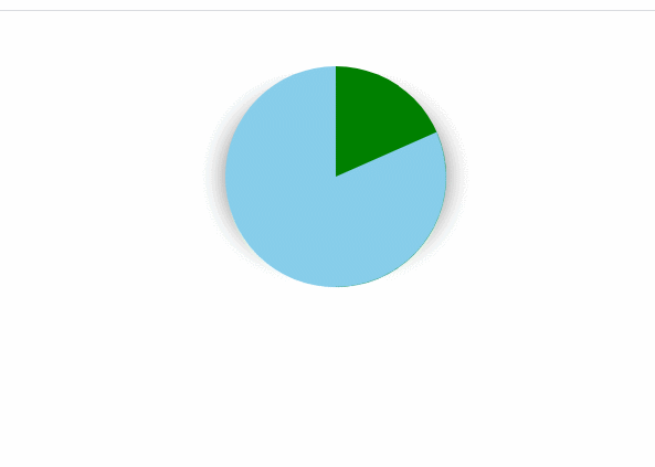
1、先设计一个圆,然后将圆划分为两个颜色
2、然后实现一个伪类,设计一个与上一个圆颜色相反的圆,并让这个圆顺时针旋转630deg
<div class="pig"></div>
css:
* {
  margin: 0;
  padding: 0;
}

.pig {
  width: 200px;
  height: 200px;
  background-color: skyblue;
  margin: 50px auto;
  border-radius: 50%;
  background-image: linear-gradient(to right, transparent 50%, green 0);
  box-shadow: 25px 0 25px -25px gray, -25px 0 25px -25px gray;
}

.pig::before {
  content: '';
  display: block;
  height: 100%;
  margin-left: 50%;
  border-radius: 0 100% 100% 0 / 50%;
  background-color: inherit;
  transform-origin: left;
  animation: a 3s linear infinite, b 6s step-end infinite;
}

@keyframes a {
  from {
    transform: rotate(0turn);
  }

  to {
    transform: rotate(0.5turn);
  }
}

@keyframes b {
  0% {
    background: green;
  }

  50% {
    background-color: skyblue;
  }
}
代码演示:
评论
匿名评论
隐私政策
你无需删除空行,直接评论以获取最佳展示效果