
CSS3齿轮旋转动画
大致思路:
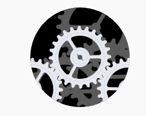
1、先建立一个大盒子,并设为圆形,然后在其中添加齿轮图片,并利用z-index实现齿轮的层次感。
2、为齿轮添加旋转特效,注意旋转角度
<div class="cricle">
  <div class="rotate1 gear1"> <img src="./img/bg-gear-f_089274a.png" alt=""> </div>
  <div class="rotate1 gear2"></div>
  <div class="rotate1 gear3"></div>
  <div class="rotate2 gear4"></div>
  <div class="rotate3 gear5"></div>
  <div class="rotate3 gear6"></div>
</div>
css
.cricle {
  position: relative;
  width: 200px;
  height: 200px;
  left: 50%;
  top: 150px;
  margin-left: -100px;
  border-radius: 50%;
  background-color: #000;
  overflow: hidden;
}

.gear1 {
  left: 50%;
  top: 50%;
  margin-left: -63px;
  margin-top: -63px;
  animation: shun 5s linear infinite;
}

.rotate1 {
  width: 126px;
  height: 126px;
  z-index: 3;
}

.rotate1,
.rotate2,
.rotate3 {
  position: absolute;
  transform: rotate(0);
  /* 旋转的中心点 */
  transform-origin: center;
}

.rotate2,
.rotate3 {
  width: 160px;
  height: 160px;
  z-index: 2;
}

.rotate3 {
  z-index: 1;
}

.gear2 {
  left: -60px;
}

.gear2,
.gear3 {
  top: 101px;
  background: url('./img/bg-gear-f_089274a.png') no-repeat;
  animation: ni 5s linear infinite;
}

.gear3 {
  right: -60px;
}

.gear4,
.gear5,
.gear6 {
  right: -30px;
  top: 60px;
  background: url('./img/bg-gear-br_8d4d4b5.png') no-repeat;
  animation: shun 5s linear infinite;
}

.gear5 {
  left: -10px;
  right: auto;
  top: 90px;
}

.gear6 {
  top: -40px;
  right: -12px;
  animation: ni 5s linear infinite;
}

@keyframes shun {
  0% {
    transform: rotate(0);
  }

  100% {
    transform: rotate(360deg);
  }
}

@keyframes ni {
  0% {
    transform: rotate(0);
  }

  100% {
    transform: rotate(-360deg);
  }
}
代码演示:
评论
匿名评论
隐私政策
你无需删除空行,直接评论以获取最佳展示效果