CSS3多重背景结合动画打造会飘动的热气球
大致思路:
1、引入所需要的图片,分别定义他们的位置,其中background-position: x轴 y轴,x轴 y轴;注意要和图片一一对应。
2、添加动画与关键帧
animation: ship 7s ease-in forwards;
@keyframes ship {
0%{
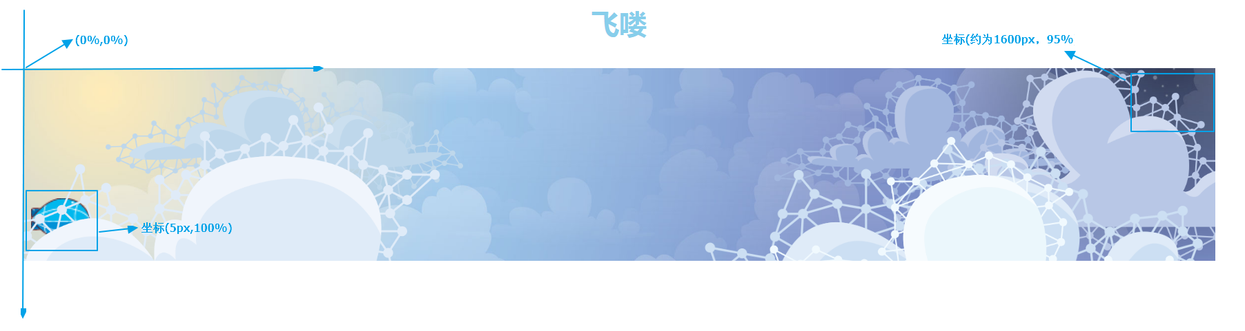
/* 第四个为热气球的位置 */
background-position-x: 150%, 120%, -350px, 5px, 120%, 10%, 90%, 0px;
background-position-y: 100px, 110px, 50px, 100%, -40px, 10px, 10px, 0px;
}
100%{
background-position-x: 200%, 150%, -500px, 1800px, 130%, 0%, 100%, 0px;
background-position-y: 100px, 110px, 50px, 1%, -40px, 10px, 10px, 0px;
}
}
x轴与平常认知一样,但y轴相反,正值是下方,负值是上方。
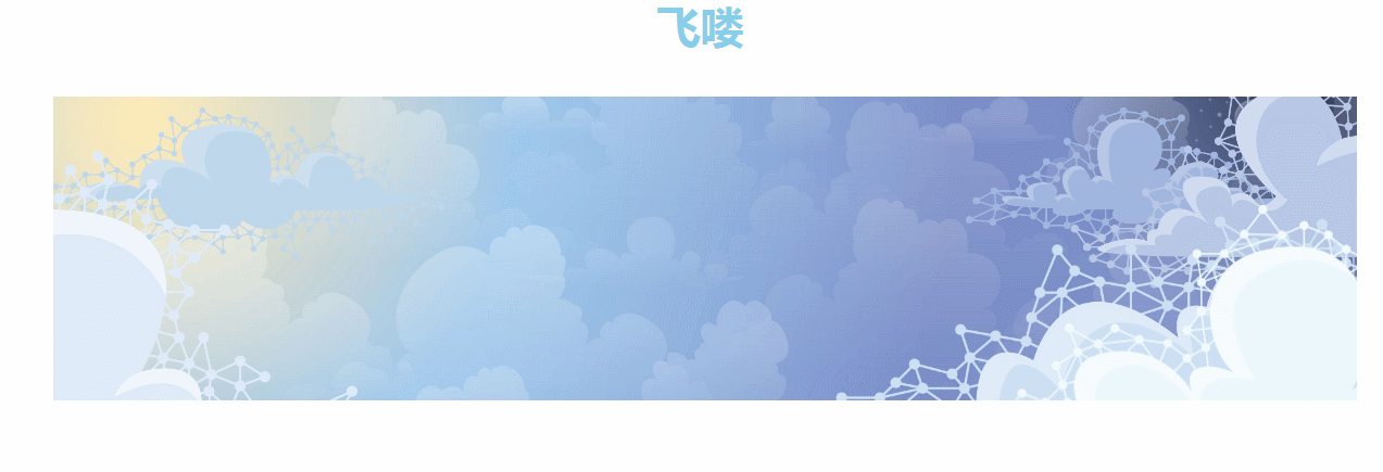
<div id="wrap"> <h1>飞喽</h1> <div class="banner"></div> </div>
css
* {
  margin: 0;
  padding: 0;
}

#wrap {
  width: 90%;
  margin: 0 auto;
  padding: 1.25em;
}

h1 {
  font-size: 2.5em;
  color: skyblue;
  text-align: center;
  margin: 1em 0;
}

.banner {
  width: 100%;
  min-width: 1200px;
  height: 280px;
  overflow: hidden;
  background: url(img/cloud-6.png), url(img/cloud-5.png), url(img/cloud-4.png), url(img/corel.png), url(img/cloud-3.png), url(img/cloud-2.png), url(img/cloud-1.png), url(img/aws-bg.jpg);
  /* 分别定义图片的位置background-position: x轴 y轴,x轴 y轴; */
  background-position: 180% 100px, 120% 110px, -350px 50px, 5px 1%, 120% -40px, 10% 10px, 90% 10px, 0 0;
  background-size: 70%, 60%, 65%, 5%, 40%, 30%, 30%, 100%;
  background-repeat: no-repeat;
  animation: ship 7s ease-in forwards;
}

@keyframes ship {
  0% {
    /* 第四个为热气球的位置 */
    background-position-x: 150%, 120%, -350px, 5px, 120%, 10%, 90%, 0px;
    background-position-y: 100px, 110px, 50px, 100%, -40px, 10px, 10px, 0px;
  }

  100% {
    background-position-x: 200%, 150%, -500px, 1800px, 130%, 0%, 100%, 0px;
    background-position-y: 100px, 110px, 50px, 1%, -40px, 10px, 10px, 0px;
  }
}
代码演示:
评论
匿名评论
隐私政策
你无需删除空行,直接评论以获取最佳展示效果