
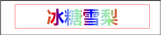
遮罩层的流光效果
<div class="box"> <h1>冰糖雪梨</h1> </div>
css:
.box {
  width: 300px;
  margin: 20px auto;
  outline: 1px solid red;
  font-size: 20px;
  text-align: center;
}

.box h1 {
  background-image: linear-gradient(to right, red, blue, lightblue, lightgreen, red, blue, lightblue, lightgreen);
  background-size: 50% 100%;
  /* 文字填充透明 */
  -webkit-text-fill-color: transparent;
  /* 背景剪裁 */
  -webkit-background-clip: text;
  /* css3的动画 infinite循环播放*/
  /* animation:lmx 2s ease-in-out infinite; */
  animation: lmx 2s ease-in-out infinite;
}

/* 设置关键帧 */
@keyframes lmx {
  0% {
    background-position: 100% 0;
  }

  100% {
    background-position: 0 0;
  }
}
效果演示:
评论
匿名评论
隐私政策
你无需删除空行,直接评论以获取最佳展示效果