
css3 animation自定义动画
animation-name 规定需要绑定到选择器的 keyframe 名称。
animation-duration 规定完成动画所花费的时间,以秒或毫秒计。
animation-timing-function 规定动画的速度曲线:
linear    动画从头到尾的速度是相同的。

ease    默认。动画以低速开始,然后加快,在结束前变慢。

ease-in    动画以低速开始。

ease-out    动画以低速结束。

ease-in-out    动画以低速开始和结束。

ic-bezier(n,n,n,n)    在 cubic-bezier 函数中自己的值。可能的值是从 0 到 1 的数值。
animation-delay 规定在动画开始之前的延迟。
值单位可以是秒(s)或毫秒(ms)。

提示: 允许负值,-2s 使动画马上开始,但跳过 2 秒进入动画。
animation-iteration-count :value 规定动画应该播放的次数。
infinite    指定动画应该播放无限次(永远)

animation-direction    规定是否应该轮流反向播放动画。

normal    默认值。动画按正常播放。

reverse    动画反向播放。

alternate    动画在奇数次(1、3、5...)正向播放,在偶数次(2、4、6...)反向播放。

alternate-reverse    动画在奇数次(1、3、5...)反向播放,在偶数次(2、4、6...)正向播放。
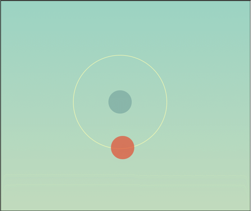
<figure> <span></span> </figure>
css样式:
* {
  margin: 0;
  padding: 0;
}

html,
body {
  width: 100%;
  height: 100%;
  background-image: linear-gradient(to bottom, #92d1c4 0%, #c9dcbc 100%);
  position: absolute;
  left: 0;
  top: 0;
  overflow: hidden;
}

/* 绘制大圆 */
figure {
  width: 200px;
  height: 200px;
  border: 1px solid rgba(255, 255, 175, 0.7);
  position: absolute;
  left: 50%;
  top: 50%;
  margin-left: -100px;
  margin-top: -100px;
  border-radius: 50%;
  background-color: rgba(238, 238, 238, 0);
}

/* 绘制小圆 */
figure::before {
  content: '';
  width: 50px;
  height: 50px;
  background-color: rgba(227, 75, 48, 0.7);
  position: absolute;
  left: 75px;
  top: 75px;
  border-radius: 50px;
  /* css3自定义动画 */
  /* 1.动画名称 */
  animation-name: wmq;
  /* 2.动画速度 linear:匀速 */
  animation-timing-function: linear;
  /* 3.播放时间 */
  animation-duration: 7s;
  /* 4.循环次数 infinite:无限循环播放*/
  animation-iteration-count: infinite;
  /* 5.动画播放方向 */
  animation-direction: normal;
}

/* 不写关键帧动画无法显示 */
@keyframes wmq {
  1% {
    transform: matrix(1, 0, 0, 1, 0, 100);
  }

  59% {
    transform: matrix(1, 0, 0, 1, 61.77302, 78.63901);
  }
}

figure::after {
  content: '';
  width: 50px;
  height: 50px;
  background-color: rgba(121, 166, 159, 0.7);
  position: absolute;
  left: 75px;
  top: 75px;
  border-radius: 50px;
}
代码演示:
评论
匿名评论
隐私政策
你无需删除空行,直接评论以获取最佳展示效果