
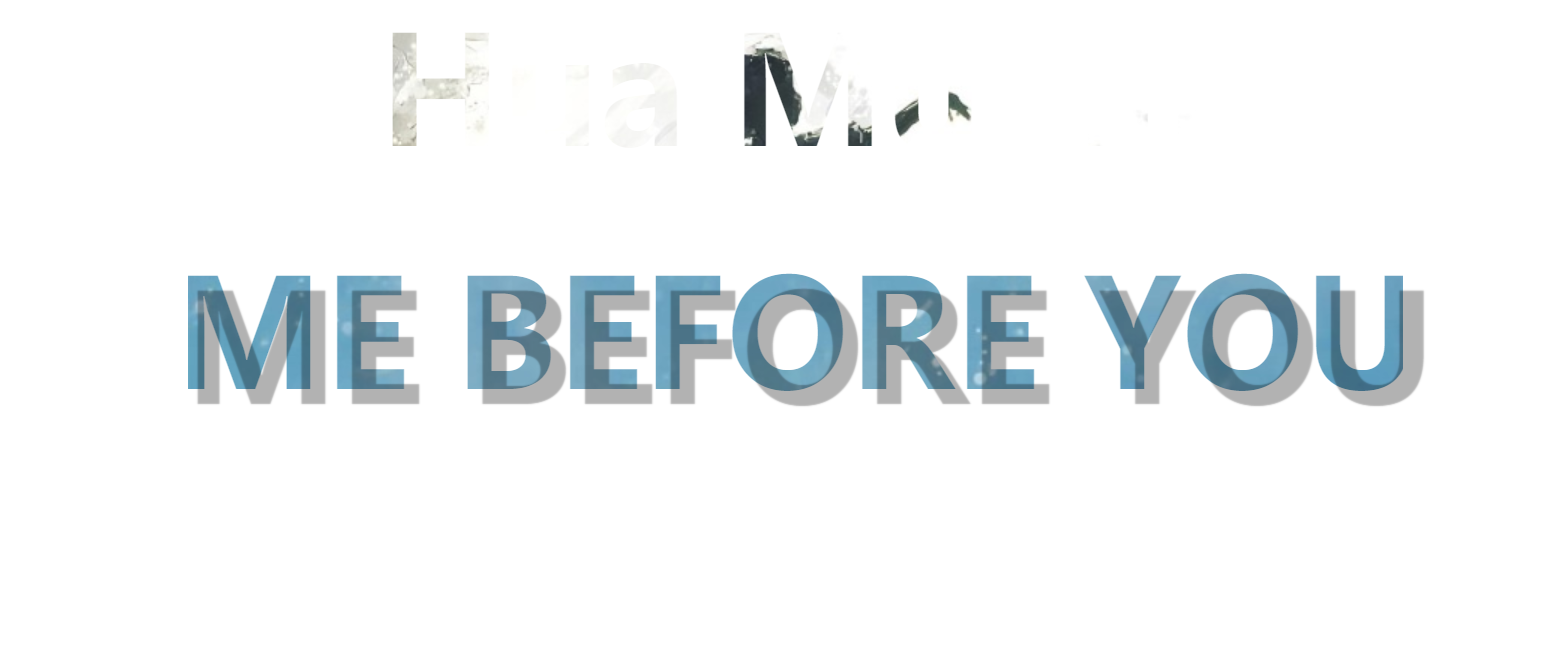
css3实现文字背景
CSS3的background-clip属性,它能够完成和photoshop相同的文字遮罩效果。
background-clip属性:剪裁文本,对两个div元素分别使用不同的背景图片。
并通过webkit-text-fill-color属性设置为transparent,确保文字的填充色为透明色。
<div class="title1">
  <h1>Hua Mulan</h1>
</div>
<div class="title2">
  <h1>ME BEFORE YOU</h1>
</div>
css:
* {
  margin: 0;
  padding: 0;
}

.title1 {
  background-image: url(img/month.jpg);
  background-repeat: no-repeat;
  background-position: center center;
  margin-bottom: 30px;
  /* 设置盒子内文字为透明 */
  -webkit-text-fill-color: transparent;
  /* 背景图剪切 */
  -webkit-background-clip: text;
}

.title1 h1 {
  text-align: center;
  font-size: 100px;
}

.title2 {
  background-image: url(img/star.jpg);
  background-repeat: no-repeat;
  background-position: center center;
  /* 设置盒子内文字为透明 */
  -webkit-text-fill-color: transparent;
  /* 背景图剪切 */
  -webkit-background-clip: text;
}

.title2 h1 {
  text-align: center;
  font-size: 100px;
}
代码演示:

在此基础上可以添加阴影:
  /* 给文字添加投影效果 */
  .title1 h1,
  .title2 h1 {
    /* text-shadow: 10px 10px 1px rgba(0,0,0,0.3); */
    /* css3过度动画 */
    transition: text-shadow 1s ease;
  }

  /* 鼠标悬停在h1标签上时,产生过度动画 */
  .title1 h1:hover,
  .title2 h1:hover {
    text-shadow: 10px 10px 1px rgba(0, 0, 0, 0.3);
  }
当鼠标悬停在文字上时:
评论
匿名评论
隐私政策
你无需删除空行,直接评论以获取最佳展示效果